Honestly Rebranding
Brand identity refresh for marketing agency focused on manufacturing clients.

From Honestly’s internal all-hands presentation:
As a team, it’s important that we commit to building something specific. This focus is what we see Honestly evolving into and is born from what we do well, can be best at, and energizes the team.

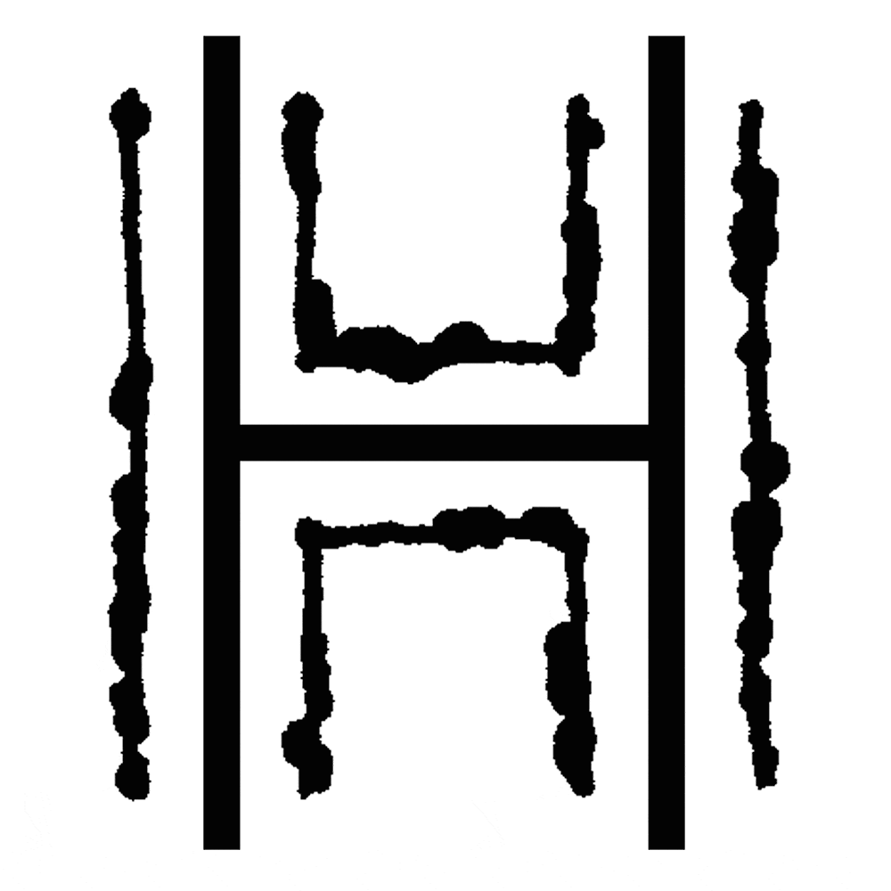
Before

After
Our Approach
Honestly is a remote-first marketing agency with clients and employees in multiple locations. They had an identity that was created when it was essentially a one-person shop. With new leadership, a growing team, larger clients and new positioning, it was time for a change.
While the existing “Halo H” logo was a fun nod to the name, they wanted a more mature mark prospective clients would take seriously.
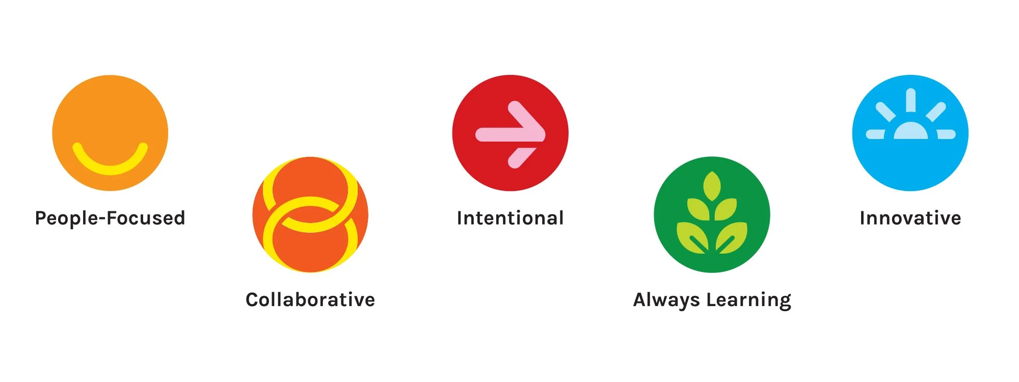
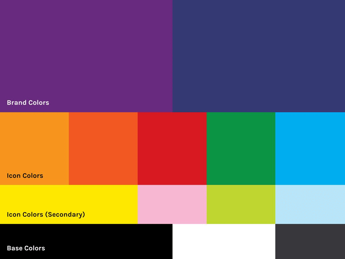
As part of the internal planning process, an “operating system” was developed that would benefit both Honestly’s team members and clients. The existence of this system led to the development of an icon family representing each of the five parts of the system: a smile for being people-focused, links in a chain for collaboration, a directional arrow for moving with intent, a growing plant for continual learning and a blue sky with a rising sun for innovation.
The Result
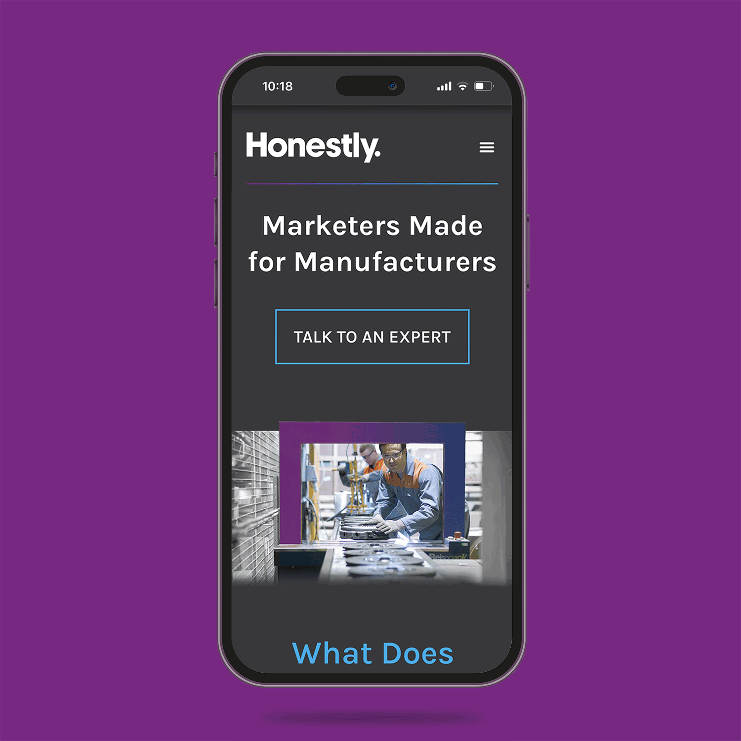
We developed a clean, modern and unique wordmark ending with a period, a visual way of saying to a prospective client, “You’ve been looking for the right marketing partner. You just found us. Full stop.” The wordmark is also filled with a gradient to signify dynamism and change as opposed to a fixed state.
The icons are able to drop in and out of the wordmark as an additional dynamic element or can work on their own. This allows for flexibility in applications like animation and fun secondary marks when the occasion calls for it. (Think about items like business cards.) The colors and icons serve as a nod to the creative approach Honestly provides to each client.
We also fell in love with a beautiful serif display typeface called Prata, so it’s used whenever possible, ranging from business cards to presentation decks.
The photography choices focus on Honestly’s core base of manufacturing while speaking to the transformative nature of working together.


Discipline
Brand Identity
Client
Honestly
Responsibilities
Logo, icon family and brand system development
Project Team
Elliot Strunk, Studio H
Valecia Hopper, Jocelle Teresa, Honestly