The Shape of Trust
February 15, 2023 // 3 minute read

Can anyone own the circle?
Let me ask the question in a slightly different way.
How is it that five companies in completely different industries can “own” the circle shape in a way that’s not only familiar, but ubiquitous enough that you likely have a product with at least one of these logos in your home (if not on your person) right now?
Don’t believe me? Let’s conduct an experiment…
Here’s a circle:

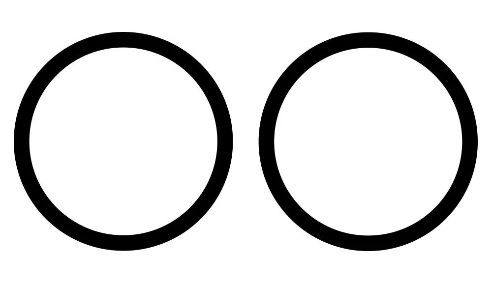
Here are two circles:
Overlap them and you get this:
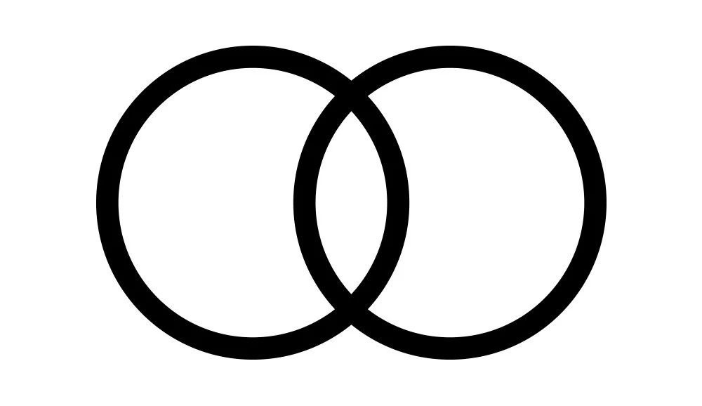
Ring any bells? No? Maybe? That’s okay. We’ll come back to it.
Here are three circles:
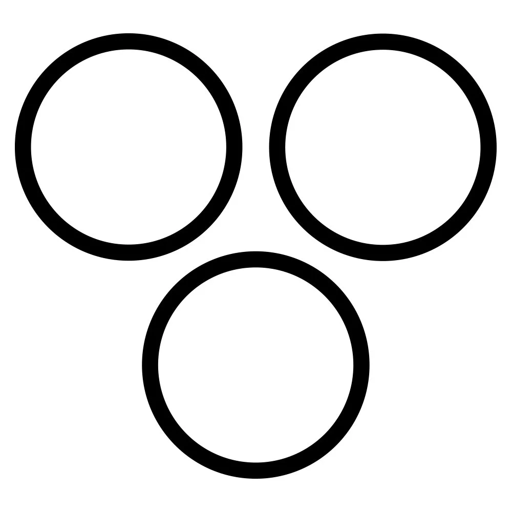
Let’s scale and combine them…
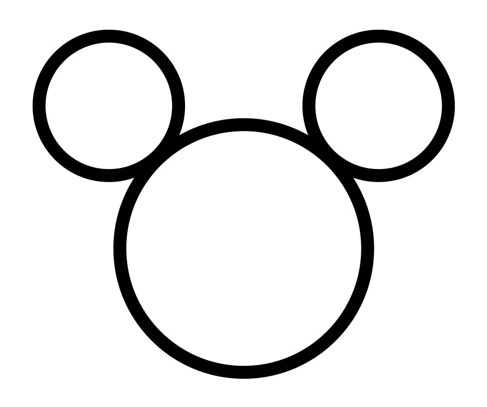
…and fill them in with a solid color.
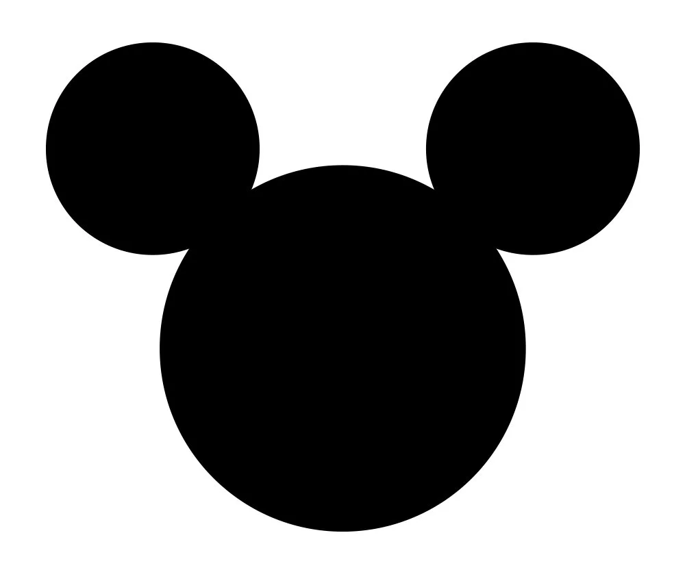
Starting to look familiar? Yes, it’s for the House of Mouse, the Disney icon.
What if we overlapped the circles instead and added red?
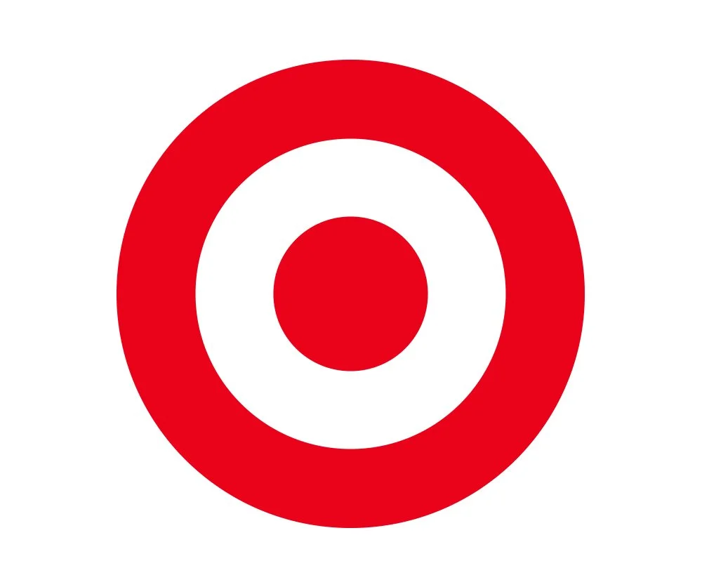
Yup, you’ve shopped here. It’s the Target logo.
Now let’s play with four circles:
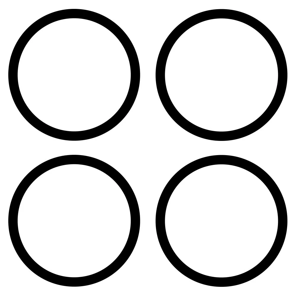
Arrange them in an overlapping line…
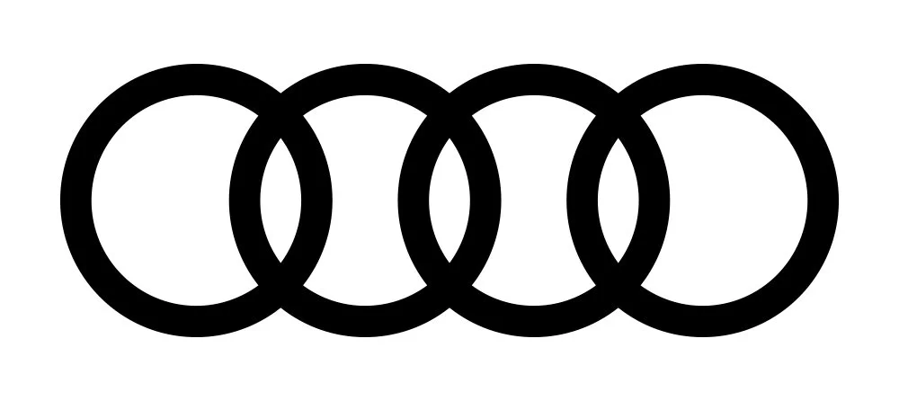
…and you have Audi.

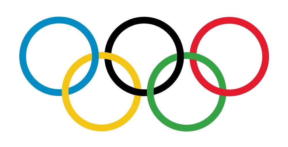
The leap from four overlapping circles to five should be a simple one, especially if you make each one a different color…
This is the value of a strong mark. Of good design. Beginning with something commonplace and making it exceptional and ownable.
I bring this up because everyone—even diehard aesthetic junkies—may wonder from time to time if good design is worth their investment. Not only in terms of money, but time; the bandwidth consumed on the part of both client and designer to stick the landing and get it right. To make the most of the opportunity.
I believe it is.
Good design tells your customer, donor or visitor that you care about them. Even though these marks are all just made of circles, there’s something fun and friendly about them.
Good design engenders good feelings. It breeds familiarity and builds trust. In fact, the only word more understood globally than “Coke” is “okay.”
Good design is a springboard to solving a problem. It knows when to be present and when to get out of the way. Dieter Rams, the influential industrial designer for Braun, cites this as one of his ten rules for good design.
Steve Jobs had a great perspective about design and its role at Apple, one of the things that made him such a unique leader:
“Most people make the mistake of thinking design is what it looks like. People think it’s this veneer – that the designers are handed this box and told, ‘Make it look good!’ That’s not what we think design is. It’s not just what it looks like and feels like. Design is how it works.”
Apple’s ill-fated circular mouse? Well, that’s another story.
The phone you may be reading these words on now is the result of years of design and user experience decisions. The first time you picked it up and considered buying it was in a setting anticipating that interaction and evaluation. And every app on your phone, the experiences you have when using it, is the technological soup of both good and bad design decisions—a fusion of the familiar and the new—all contained in this glass rectangle you hold in your hand.
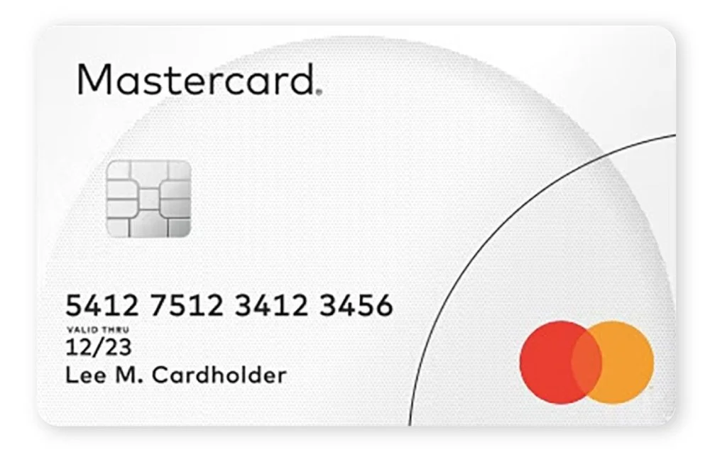
Speaking of shapes, have you figured out our two circle logo yet? One last hint: you’ll find it on a rectangle you keep in your wallet.
Thoughts? Questions? Let me know.
Elliot Strunk, an award-winning designer with over 25 years of experience, is the Creative Director of Studio H. You can learn more about him here.